Created a design system worth $800,000
My Role: Lead UI Designer
Summary: I spearheaded the project to completely overhaul the KLAS design system. This included recreating components and processes to be WCAG accessible, collaborating with multiple departments to plan for use cases, and creating a naming structure with Tokens for easy implementation.
By the end of the project, the system was estimated to be worth $800,000 after calculating the time saved by developers and designers if they used the system.
We've all been through work lulls when you're unsure what to do next. During one such lull, my manager suggested I dive into accessibility.
What initially started as a learning project on accessibility eventually evolved into an 8-month-long revamp of the design system, transforming it into an accessible platform while addressing some of KLAS's technical debt.

What if I told you that each time you wanted to change something on the website, you had to break another part of the website? I would hesitate to change anything!
This was the developer's life every single sprint! Because of this, the company went further into technical debt. The backlog was cluttered with bug fixes, innovation was sidelined, and users were frustrated because of a poor user experience.
💰 If inaccessibility caused a healthcare provider to make a mistake, KLAS could be liable and required to compensate that organization. In healthcare, that could cost millions.
😡 Developers continually had their sprints interrupted with bug fixes, causing them to work overtime to finish tickets.
📚 Clients would continue to avoid the website. Instead, they would call client managers directly. This created a building up of sub-optimal relationships and cluttered manager's schedules.
It would be almost impossible to overhaul the design system if I didn't understand what currently existed and each component's use case.
The first month was spent documenting:
👤 use cases
🟥 components
🖱️ interactions
♿ and accessibility issues
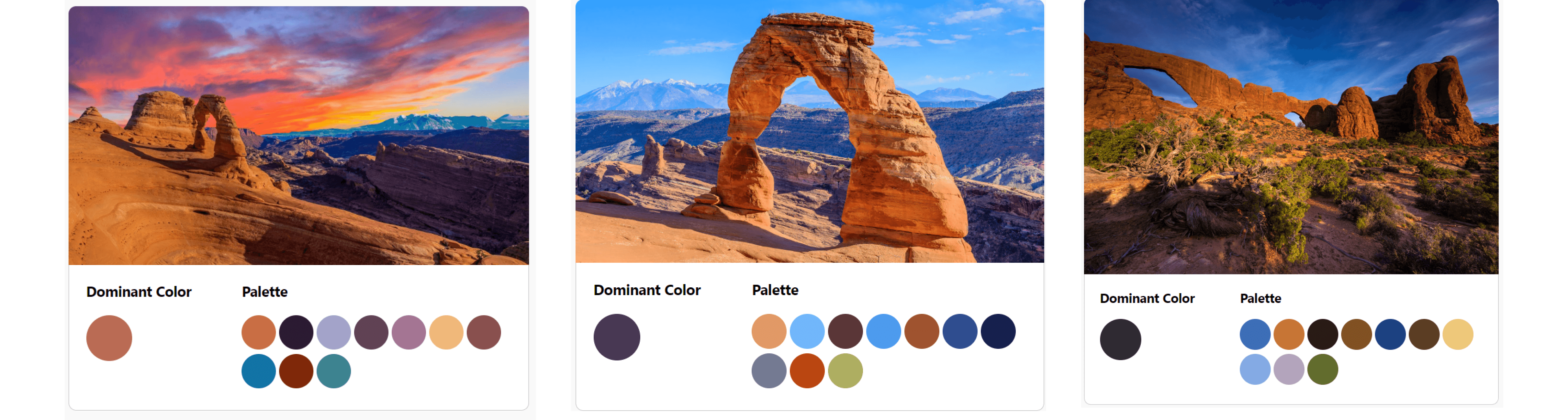
This was possible by conducting a thorough accessibility and brand audit.
What's the best lesson? The ones you teach yourself!
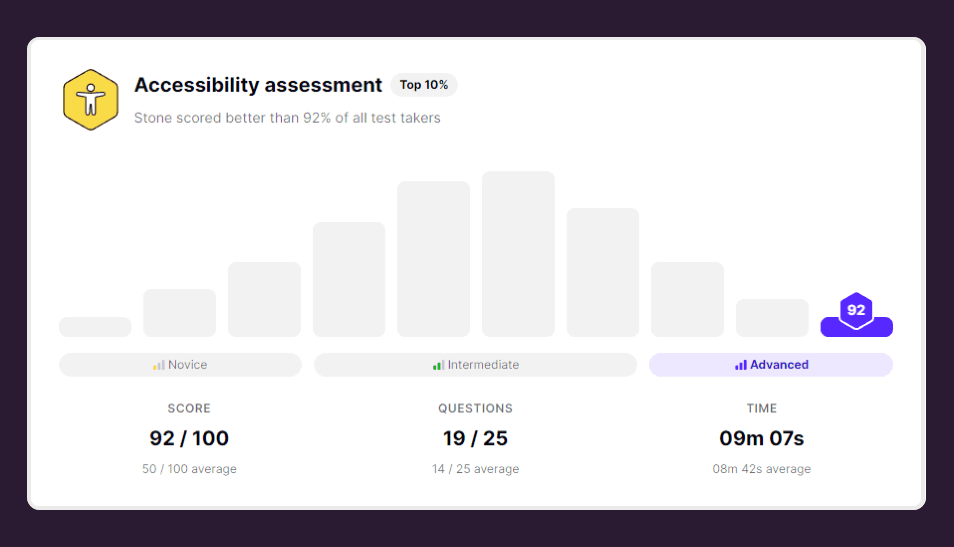
The results of my audits helped me realize that I needed to become an expert in accessibility if I was going to do this right.
I proceeded to read books, take courses, and study WCAG accessibility standards before I made any major changes to the system.
By the end of my self-directed boot camp, I was recognized as an accessibility expert by UXCEL scoring in the top 10%.
See My Accessibility Checklist 👀
Re-designing the components
The existing design system had more components than KLAS needed, confusing designers and creating inconsistencies we couldn't afford across the website.
All the clutter was causing issues for the development team since they needed to code each component manually. This caused projects to take longer than estimated.
I needed to show the team that less was more. A simpler design system would create a better user experience across the board.
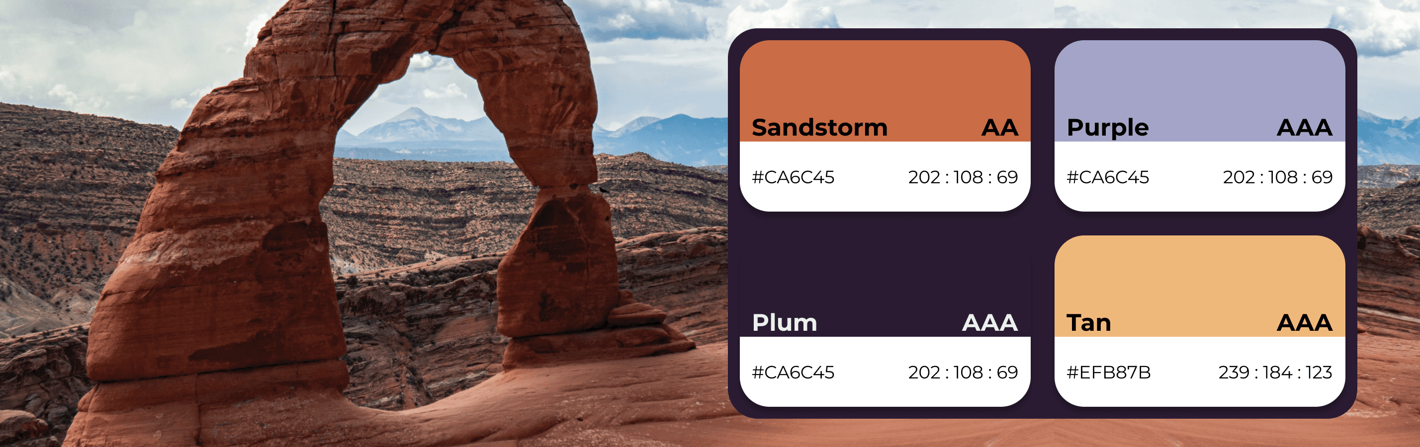
Users were upset because data visualizations had too many colors and data points which made them difficult to read.
It is best practice to have no more than 6 data points on a graph and KLAS frequently had up to 12!
It was up to me to collaborate with multiple teams to make a color palette that was:
🎨 12+ colors
♿ AA Accessible
👥 Meet the needs of all departments


Several of KLAS's bugs stemmed from developers manually coding each component, opening the door for errors every time something was deployed.
They needed a simpler and more effective method to edit the website that would save developers time and mental load.
I created a naming structure and implemented design tokens used for each component in the design system. I also worked with developers to connect design tokens to Azure DevOps for easy implementation.

All this work would mean nothing if I didn't document and share new resources with the company.
I created documentation for each component and color, including:
✅Proper use
❌Improper use
🏆Best practices
♿and Accessibility Standards
The plan was to introduce the design system to each team and create trainings to help individuals understand how to use it.


