Website Re-Design & Re-Brand

My Role
Solo Designer - Research, Discovery, Negotiation, Information Architecture, User Interface

My Team
N/A

Time Frame& Status
3 months - Deployed

My Role
Solo Designer - Research, Discovery, Negotiation, Information Architecture, User Interface

My Team
N/A

Time Frame& Status
3 months - Deployed

Overview
Have you ever been good at something, and it was your secret? Well, CVMA was tired of it being a secret.!

They wanted everyone to know that they had coaches who were recognized worldwide, students who were fighting for championships, and facilities that were top-notch.

It was my job to increase customer acquisition and retention through a website re-design and a completely new brand overhaul.


Outcomes

Here are some things we achieved in this project

📈

Increased Website Traffic by 24%

🥇

Ranked #1 for local Google Search

🤼

Increased amount of free trials used

What do they have?

What do they have?

What do they have?

CVMA started off with an extremely basic website that had a bright yellow background and black text. I wanted to attend this gym, but couldn't find their hours, where to sign up, or anything except for a schedule to let me know what I needed to do to join.

Who am I Designing For?

Since this was mainly a marketing website it was critical that I understood who the target audience was and what their Jobs to Be Done (JTBD) were. The better I understood this, the better I could encourage people to come to the gym.

Field Research

I attended this gym regularly and wanted to see it succeed. I spent 3-4 hours a day around their regular students, newcomers, and coaches. Eventually I asked questions and interviewed people to better understand why they came to the gym. 

I attended this gym regularly and wanted to see it succeed. I spent 3-4 hours a day around their regular students, newcomers, and coaches. Eventually, I asked questions and interviewed people to better understand why they came to the gym. 

Market Research

By using competitive analysis and market research I was able to get a better understanding of which gyms were successful and why, then use that information to make CVMA's offerings better. 

What is the most important information?

You only have a few seconds to capture the user's attention. If you can't answer their question or concern right off the bat, youv'e probably lost them! Because of this, I focused on information architecture from the very beginning. 

  1. Free Trial

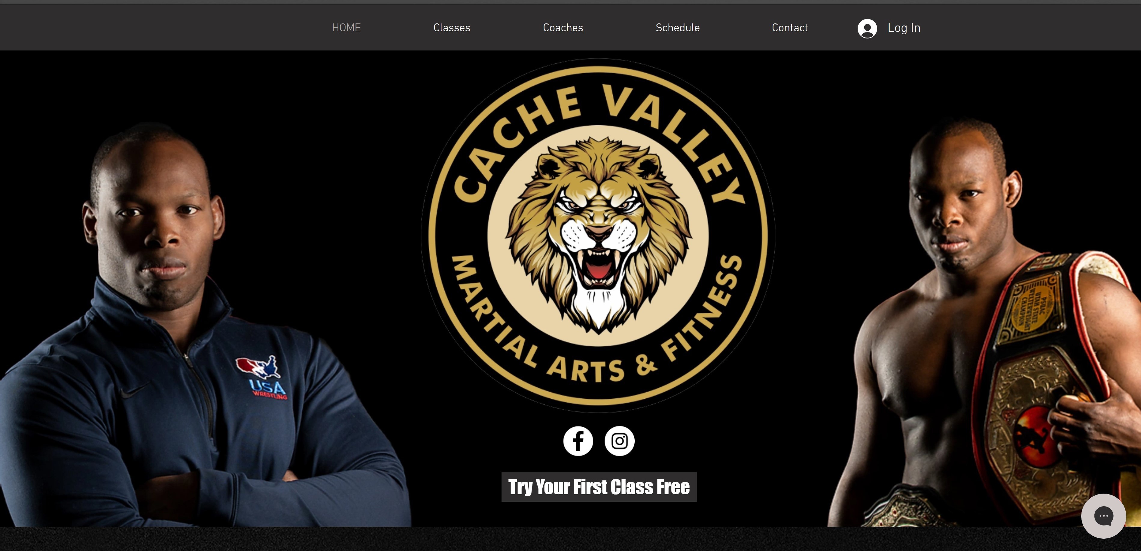
The most important Call to Action is, "Try the first class free". This tells the user exactly how to sign up and lets them know they don't have to commit until they are ready. 

  1. Class Types

Next was to explain what they could sign up for. Since CVMA taught multiple styles of martial arts, I explained the difference between each and what they would focus on. 

  1. Coaches & Credentials

Now, we wanted users to feel confident that they were getting the best coaching. This would help them feel safe by knowing they were in good hands and giving them confidence that what they learned would be applicable.

  1. Class Schedule

This schedule was mainly for returning students but was also necessary for newcomers. From research, I discovered that many website visits were students double checking the day and time of the class they wanted to attend.

  1. Pricing

After establishing that coaches were professionals and that the first class was free, we talked about the price if they want to continue. 

How Would a Re-Brand Help?

We want to leave a lasting impression on anyone who comes to the website, whether or not they choose to sign up. The best way to do that was to use CVMA's colors, pictures, and fonts. I wanted to CVMA to be seen as:

- Professional
-Confident
-Bold
-Strong

Which Font is Strong and Bold?

When I asked myself this question I knew that I had to give Impact a shot. CVMA's original font was Roboto but by the end of the design process, I felt that Impact was the right font for CVMA and decided to use it on all the headers. Impact is a great font for being loud and proud, and that is exactly what CVMA needed. 


For normal text and sub-text, I chose a lesser-known font called "din-next-w01". While not as strong as Impact, it paired nicely without taking away the effect I wanted. 

While Bright Yellow is Loud…It Doesn't Look Good

On the original website CVMA had a bright yellow background. We decided that a dark background with gold text felt more professional and lived up to their slogan "The Place For Champions".

Is Mobile or Desktop More Important?

Is Mobile or Desktop More Important?

The majority of visitors were on mobile, and since the website was not mobile-friendly, most people had a terrible user experience.

I used a mobile-first approach, shorter paragraphs of text, and accessible CTAs that were easy to press. Because of this, we saw most mobile users were able to find what they were looking for on the website, and CVMA saw higher conversion rates.

Want to read more?

See how I was able to information architecture and design best practices for a world-class track.

Want to learn more?

I would love to dive deeper into my process around this case study.

Logo that says Stone Sagala with a rock icon